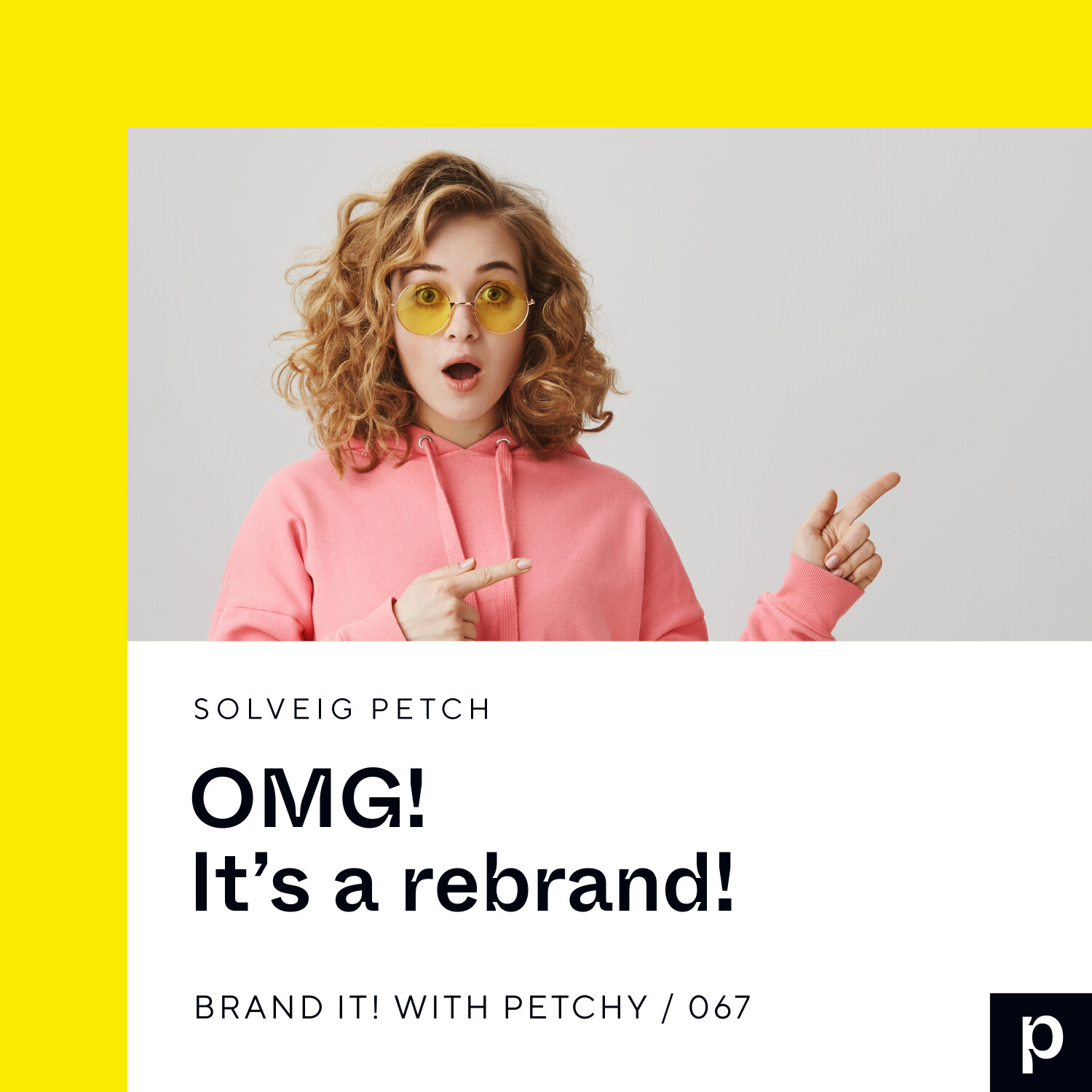
OK, so this is exciting! And terrifying. But mostly exciting. When you're a brand designer, one of the hardest damn things in the whole world is working on your own brand! And yet, that is exactly what I've been doing for the past few months.
I'm 42 today, and this is my gift to myself: a bolder, braver, and more edgy iteration of my brand. I'll be rolling it out across all my platforms and collateral over the coming month or so, starting with my evergreen Instagram grid, the most important parts of my...
View more
Comments (3)
More Episodes
All Episodes>>Get this podcast on your phone, Free


Create Your Podcast In Minutes
- Full-featured podcast site
- Unlimited storage and bandwidth
- Comprehensive podcast stats
- Distribute to Apple Podcasts, Spotify, and more
- Make money with your podcast
It is Free